Wednesday, 30 December 2009

Summary of Research into existing Magazines

This post is a summary of the research i undertook into different magazines of a similar genre to mine. For my music magazine, i have chosen to focus on the rock/metal genre of music as this is the one that i find interesting and have a lot of knowledge on. I have been reading music magazines since 2008 (specifically Kerrang! but i have read a variety also) so essentially i have been researching since before i started college, and i have gaine lot of insight into how these magazines engage the reader beforehand.

Above is a link to my previous blog post with the research into magazines of a similar music genre to mine. In this blog, i have taken 3 rock/metal music magazines (Kerrang!, Metal Hammer, RockSound) and disected the contents and ways in which these magazine attract their audiences. This was useful because by looking at these magazines in a media perspective, it really helped me understand what these magazines do to manipulate their audiences into buying more copies. For instance, Kerang! uses simple layouts, lots of images, and colloquial language, so that their target audience feels more comfortable reading the magazine. Metal Hammer on the other hand uses aggressive images and a dark colour scheme, to attract its audience of more extreme radical teenagers, and RockSound includes new unsigned bands and stays very underground, which attracts its audience who challenge dominant ideology by listening to far less mainstream acts.


This link is to a previous blog on a spectrum of music magazines, not just my chosen genre specifically. This blog included segments on 3 music magazines (Music, Kerrang!, Mojo) By researching into magazines that focus on different genres of music, i could see how they use different techniques to engage their audiences. BBC Music magazine is a prime example because it focuses on the classical music genre, which is associated with older generation traditionalists. It uses a wider vocabulary range than other magazines and includes a select one or two prominant photos instead of a variety, as used in other magazines. This research helped me understand what not to use in my rock/metal magazine, because i know now that if i use big words like in Music i would alienate the target audience who are most definately not the same as Kerrang! or others.

From my research i have determined that my magazine, would not be as "chatty" as Kerrang! and not as aggressive as Metal Hammer, and not as plain as RockSound, it would combine these three magazines to form one magazine that would appeal to a wider target audience. It would include the underground level from RockSound, the uses of images from Kerrang! and the format of the text from Metal Hammer, these three features are the features i found most interesting in each magazine.

Tuesday, 29 December 2009

Audience Profile

My magazine is focused on metal and rock music and so i am aiming to target the ever expanding "niche" audiences. This niche audience comprises of: radical teenagers (now known as emos) This audience will be largely males, but still with a few females, all aged roughly between 15-19, and on a low income (D/C1)because they are in full-time education. This audience would register as post-materialistic hedonists because of their radical fun-loving nature.

The type of audience that would read my magazine would wear: black t-shirts (band t-shirts most of the time), jeans topped off with a studded belt and chain, and canvas shoes most likely Converse Hi-tops. The males would have long hair, with the fringe covering at least on of their eyes, this hair could possibly be dyed black however it is not certain. The females would have very alternative hairstyles, red colour perhaps with bizarre coloured highlights. These people would have a low income job, possibly in the local supermarket or a store in town, definately in the shopping industry in a shop is the most likely for my target audience or maybe even a pub/restaurant (D/C1)

My target audience would spend the majority of their money on cigarettes, drugs, alcohol, clothes and music, with little deviation from those items. They would shop in places like: CEX, HMV, Four Leaf Clothing, H&M, Topshop, Burton, Office. They would watch a large variety of comedy shows, mostly on Dave and Channel 4 and not be associated too much with ITV and the BBC channels, the main tv channel would be Scuzz, the metal/rock music channel. Specific TV shows might include: Live at the Appollo, Never Mind The Buzzcocks, Mock The Week, Scrubs, Friends. They also enjoy films such as: Avatar, Harold & Kumar, Dude Where's my Car? (and similar "stoner" films) Pirates of the Caribbean Trilogy, Batman and similar films.

The music is obvious, Rock and Metal. Bullet for my Valentine, Funeral For A Friend, Rise Against, Paramore, etc, etc...

The target audience, enjoys spending time with friends, smoking cannabis, and similar activities, the majority of this audience would most likely be musicians, in bands or otherwise.


Monday, 14 December 2009

Research and Planning: Distribution

The Major distribution strategy is full of different elements which coincide with each other and complicate the system. Below is the supply chain for Frontline (part of the Bauer Media Group conglomerate) there are 15 spaces which labels the different aspects of Bauer's supply chain.
Majors like Bauer Media, distribute their magazines to a wide variety of outlets such as Tesco and WHSmith, this broad level of distribution doesn’t target their audiences specifically, for instance the audience for Kerrang! Aren’t likely to go shopping in TESCO to buy the magazine. This is where Independents benefit over Majors, because they target their consumers specifically at shops they would go to.
Vice for example, distributes their magazine in bars and cafés where they believe their target audience shops. If Bauer Media distributed their magazines in this way, Kerrang would be sold in music shops or shops like Four leaf Clothing, this distribution method ensures Vice a 100% pick up rate (especially because the magazine is free)
For my magazine the audience would be similar to that of Kerrang magazine (free-minded radical teenagers)

Friday, 11 December 2009

Main Task: Magazines (My Chosen Genre)

For my chosen genre of magazine, i am going to do the metal/rock genre. This is because that is my favourite genre of music and i believe that i can use my knowledge from existing magazines of this genre to create my own.


Kerrang magazine is "the world's biggest selling weekly rock magazine" and so has essentially created a winning formula for their magazine. But how has Kerrang become so popular, and what do people like about it?

Kerrang! is a British magazine that was first published in June 1981, and is devoted to the metal/rock genre of music.
Kerrang's audience is largely radical teenagers that possibly challenge dominant ideology, roughly in the age group of 12 - 18. The audience may also be aspirers who aspire to be musicians. The name itself is such because it is the sound an electric guitar makes when strummed, and so the link to music is immediately mentioned, this connotes loudness and energy, which appeal to the target audience because they too like to listen to loud music (it is clear because the magazine itself is based on the metal/rock genre of music) The Kerrang website can be viewed here: http://www.kerrang.com/


The cover is a standard layout for any magazine, with the masthead at the top, and the main sell in the centre. The masthead denotes the word "Kerrang!" in upper case black font with a screamer at the end of the word. The font itself used in the masthead looks similar to smashed glass, which connotes rebellion and danger, and makes the magazine appear more youth orientated.
The main sell varies depending on the band featured, in this case, the cover on the left is on Corey Taylor from Slipknot. This cover is different from the usual covers because it is one of 9 different covers from the same magazine, encouraging the consumer to buy more than one, so they collect all the covers. At the foot of the magazine is a freebie, indicating that there are free posters inside the magazine, and again after the word posters, there is a screamer. The title itself, Kerrang, is the title because it is the sound an electric guitar makes when strummed. This is a clear link to the genre of the magazine, because the magazine is all about music, specifically rock/metal which feature electric guitars heavily.
Kerrang! magazine usually follows this layout and has cover-lines just above the barcode in alternating colours, depending on the colour scheme for that week. The colour scheme for the cover to the left is predominantly white and red, these colours may be plain and neutral, but it is not them that are selling the magazine, it is the main image, which denotes a man in a scary looking magazine. The main image is a close up of the artist's face, in my opinion i don't think that this is a good idea for my magazine and so i am against having a close-up as the main photograph. The people in the images are being presented as cool and rebels that challenge ideology. For example in the Metallica review below, Lars Ulrich (the image on the bottom far right) is seen spitting his water into the air, which connotes rebellion, and is exactly the way most of the images included in Kerrang! are presented.


Kerrang's content follows a very simplistic layout. Blocky is the word that can aptly describe this layout, the main articles have captioned images, and "this week" has a list of features included in the magazine. I think that this layout looks too amateur and so i will not be immitating this design. However at the head of the contents page is an editors note, which is a brief paragraph of the editor's views on the week. I will include a small image of the font cover on my contents page, because it connotes professionalism, as has the small image of Kerrangs cover at the head of their contents page. Despite being simple, it clearly displays the contents of the magazine, without over-complicating it, this i think is very useful and for my target audience is appropriate, however i think that Kerrang's contents is too simplistick for my magazine.

Kerrang includes features on live reviews, from concerts predominatley in the UK, but if important enough overseas. The image on the left is a typical double-page feature on a live review: the pictures out weigh the text, and for good reason because i believe this is for maintaining the reader's attention, because -broadly speaking- the target audience for this magazine does not have a vast attention span. This double page spread uses one main image as the main image and background, and only a few images to support the main. The ration of images and text is shifted significantly towards images, because of the lack of text i would say that this amount is suitable for the target audience of Kerrang! and because i would like a similar target audience, i won't have too much text on my double-page.


On ocassion Kerrang! has features like the one on the right, which are dedicated to the "100 Best of..." (in this case albums of 2009) these features follow a basic layout with images scattered around the pages. This is audience related because the results are chosen by the readers, who can vote online, thus maintaining the audience's attention and keeps them buying the magazine.


Kerrang! addresses it's audience by using rather simple language, that is colloquial and specific to their target consumer - teenagers. Words like "why 2009 ROCKED!" and "also in this week's MAG" are colloquial terms, which are solely used by the youth of today, so it could be said that Kerrang! specifically adresses the teen audience, which is slightly patronizing but not overly.


Kerrang! magazine is published by Bauer Media, who are also associated with such magazines like; Heat, FHM, and a vast array of other magazines, including the music magazines; Q and Mojo. This means that Bauer Media have a huge sum of knowledge on publishing magazines because it publishes aproximatley 59 magazines (from http://www.bauermedia.co.uk/Brands)


Started in 1983, Metal Hammer magazine is the second largest selling rock magazine in the UK (second to Kerrang!) Unlike Kerrang! Metal Hammer is dedicated only to Metal music, which is gaining an increasing number of fans, and is a monthly magazine (where Kerrang! is weekly) Becuase M.H is a monthly magazine, it can afford to be slightly more expensive and upmarket. The name Metal Hammer is associated with the genre that it is about: metal. This title connotes toughness and violence, words that are linked to the metal genre itself. Below is a link to Metal Hammer's website:
http://www.metalhammer.co.uk/magazine/


The audience is again radical teenagers, more radical than the audience for Kerrang! and moving into the young adult ages aswell, so roughly the 15 - 20 age group. The audience would be made up of people that challenge dominant ideology and share a passion for music, i would say that the audience for music magazines is an audience largely comprising of musicians. The target audience would also be in the C1/C2 category, because of the fact that the magazine is more upmarket (due to the glossy cover) and expensive.
Metal Hammer is the title largely due to the magazine's metal music contents. It connotes violence and toughness, words that are typically associated with the metal genre of music. The masthead denotes the word 'Hammer' in big upper case, white letters, with the word 'metal' also in upper-case, but in black and tilted vertically in the 'H' of 'Hammer', alos 'metal' is in a different font that is more gritty and edgy.

Metal Hammer uses a dark colour scheme, red, black,orange, white, the colours used connote anger and rage, fire colours like reds and oranges help support this. These colours share the same connotations as the metal music which the magazine is based on. M.H uses a sans-serif font and refrains from uses long words, this is so the magazine doesn't confuse its target audience of teenage under-achievers.

Metal Hammer uses the usual features of a music magazine: live/album reviews, music news etc, but what makes M.H unique to other music magazines is that it has a segment called "tatts life"

Tatt's life is a feature on muscian's tattoos, it includes images and the story behind the tattoos and a little advice for the readers. This is one of the main selling features of this partcular magazine, because of its originality, also because the radical target audience are the type that want tattoos. M.H has found a niche subject that appeals to its target audience. The photos used throughout the magazine are of the musicians, who are always in tough poses, these photos feature the musicians predominately (instruments included) and do not feature objects on there own. In this double page spread, M.H has included a substantial amount of pictures - most interestingly the circular images which do not follow the traditional rectangle/square frames - I think that it is important to have numerous images on a double page spread, but all of those on this example make the page seem some what cluttered and untidy. I am keen to have a photograph on a double page that blends into the background seamlessly, such as the image of Corey Taylor (bottom left) This double page has an equal ratio of images and text, this is important because it keeps the readers interest and prevents boredom.


What makes M.H appeal to its target audience is that, aspiring musicians amongst M.H's audience have the oppurtunity to feature in the magazine by sending in a demo of their band and they then have a chance to appear in the magazine if they are selected.


Metal hammer is published and distributed by Future publishing, who also publish similar music magazines such as: Classic Rock, Total Guitar, Rhythm and more! So Future PLC have a wealth of experience in publishing music magazines. For a full list of Future PLC's portfolio, visit: http://www.futureplc.com/what-we-do/portfolios/


Rock Sound is a monthly british magazine which leads in alternative music. The magazine aims at being more "underground" and less commercial, whilst also giving coverage to more well known acts. It also has a (as of Jul-Dec 08) readership of 74,000, this proves that Rock Sound has a rather large audience. The target for Rock Sound differs slightly from Kerrang! and Metal Hammer in that it also targets alternative peaople who prefer the underground acts that are less commercial. The audience for R.S would be more like achievers and aspirers than radicals, and more post-modern and hedonistics, an audience that embraces new music, possibly D-C2 on the Jicnar scale aged 16-24 both male and female in an equal ratio.


Rock sound's contents page is dominated by a main image and has the listings on ither side of the image, from loeft to right at the bottom of the page. This is an interesting layout because of this, however i think that it is too different to incorporate into my magazine, mainly because when i first saw it, i was confused whether it was the contents or not and so if i was confused, i think the audience would me too, and so that is why i am not going to include this risky layout into my contents. On the following page, R.S has a secondary cotents page with all of the necessary information on each with a strap-line and a page number which are highlighted in a different colour to the rest of the text. As with Kerrang!, R.S has an editors note on the contents page, reviewing the magazine and the month in general. This contents has few images and sticks to a red, whit and black colour scheme.


The title Rock Sound is all to do with the style of music that the magazine is about, it connotes music, and the overall sound of rock. The masthead itself denotes white, upper -case letters in a sans-serif font. The images used connote aggression but also humour, as you can see from the cover example, it clearly denotes a decapited male, but because it also denotes obvious cartoon-like blood and gore, this means that it appears more comical than an actual decapitated head.

A common article in R.S, follows a typical basic layout: few images and plain almost bland text. The test itself is in a sans-serif font on a standard white background, the only parts that are emphasized are the headline (bold,bigger text) and the strap-line (which is reversed out) Despite the layout being rather basic, i think it suits in well with the target audience of Rock Sound, who don't need lots of images to stimulate their brain (like in Kerrang specifically) and are content with a couple of important images.


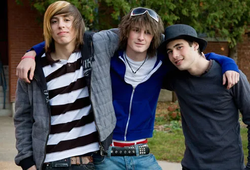
What makes Rock Sound unique from the other muisic magazines, is that it focuses a vast portion of its pages to new music - most of which are unsigned and very underground - it also features articles on more commercial acts. Not only does the magazine cater to features on musicians, but alos underground producers, such as Sam Hayles (left) this adds more variety and depth to the magazine, because it is not just about the music, but about making the music and new upcoming acts. Also, rock Sound magazine features the usual suspects found in music magazines: live/album reviews, band features and interviews.


Rock Sound uses very relaxed terms in its magazine, it doesn't use colloquial language as much as Kerrang! but still has a flavour of it in the reviews, R.S uses standard english words which make it seem more professional because it is slightly mor upper class than Kerrang!. R.S uses quotes heavily from the artists, because it uses a lot of interviews within its pages.


A double-page spread in Rock Sound, follows a standard layout, the colours are all very monochrome, apart from the images. Such with the first double page example (above) a double page in Rock Sound will usually have one page solely for pictures and the other for a combination of text and images, In most cases the article will only have a small photograph of the person the article is about, and focus more on the work that they produce, this ethic is one that i feel is important for more established magazines such as Rock Sound, but for my magazine i don't think i can afford to have few images of the artist in question.


Rock sound is published and distributed independantly by Rock Sound itself, (who also have a tv station) Here is a link to the Rock Sound website: http://www.rocksound.tv/

Wednesday, 9 December 2009

Main task: Magazines

The task at hand is to create a new music magazine from scratch, using our own images and text.

Key dates to remember are:
8th January - Research & Plannin Deadline
12th February - Production Deadline
5th March - Evaluation Deadline

Monday, 7 December 2009

Main Task: Magazines ( with examples )


Magazine 1 - Mojo
Audience - Young adults to Adults, more spohisticated than Kerrang's audience. Achievers & Materialists (due to the glossy cover)
Main Content - Mainstream music, predominatley rock/classic rock, focus around interviews. The articles inside always follow the set colour scheme of white and red, which connotes subtleness because there are no bold colours. The magazine also includes the name of the magazine "Mojo" scattered throughout the magazine, on the one page (left) it is seen twice. The format of the articles is similar to newspapers, becasue of the column layout of the text and few images.

Brand Identity - Upmarket/sophisticated magazine (£3.80) Commercial magazine, regular free CDs. Mojo tends to only feature commercial rock acts.

Magazine 2 - Kerrang!

0000000Audience - Teens 13-18 (roughly) Radicals/Underachievers. Post-modernistic Hedonists, today's "emo" youth and music (predominatley metal) fans. Aspirers who aspire to be a musician

Main Contents - Underground, metal/rock music, interviews, gig reviews, "Introducing" section (introduces up-and-coming bands) new concerts, competitions. To the right is an image of a standard double-page spread of a live review. As a reader of Kerrang! i know that the colour schemes vary depending on the band, but usually the images take up more space than the text. The strapline is reversed-out making it stand out from the rest, and the colour scheme for this particular image, is black , neon-green and white.

Brand Identity - Downmarket publication (only has a paper cover, where others have a glossy finish) priced at £2.20 so is cheap for its genre. this magazine connotes cool and rejects the mainstream, yet does include some mainstream acts such as Green Day.


Magazine 3 - BBC Music

Audience - Traditionalists, older generation, Succeeders, classical music fans.


Main Contents - Classical music, features on composers/performers. As you can see from the image (left) BBC Music, doesn't feature as many images as Kerrang! but does make sure that the images it does include are fairly large. The test font is a plain sans-serif, which in this context, connotes ordinary and nothing special.


Brand Identity - Sophisticated, upmarket, priced at £4.20 so is an expensive magazine which reflects on the type of audience (posh, upper-class) A magazine that upholds traditional values and dominant ideology.
SIMILARITIES

There are few similarities between these chosen magazines (other than the generic layout which most magazines follow) MOJO and Music are both "glossy" magazines, named so because of the glossy finish to the cover. All of the magazines follow a standard layout e.g: masthead ast the top of the page, main sell in the centre,etc, but another feature of the cover that they all have in common and is frequently used, is that the main sell, over laps the masthead. On all three of these magazines, the tops of the chosen atrist/s' heads are covering a portion of the masthead, this may be because the brand identity of that magazine has become so recognisable that it doesn't need to show all of the masthead. Next to the main sell on each magazine is a little tag line, which reveals a little more of the story. Music magazine and MOJO both come with free CDs every issue, Kerrang! however only comes with posters and rarely includes anything else free, but despite this all three of the magazines have freebies. All of these magazines denote musicians on the cover.

DIFFERENCES

The main difference for Kerrang magazine specifically, is that it has a paper cover as opposed to the other two glossy covers, this connotes youth and rebellion, which is one factor in why Kerrang! appeals to its target audience. A difference common in all three magazines is the price, ranging from £2.20 ( the humble Kerrang!) to £4.20 (the expensive BBC Music) a whole £2 difference! However the reasoning behindd this is the target audiences, BBC Music's audience is more the upper-class citizen who can afford to spend £4.20 on a magazine, whereas Kerrang!'s target audience is the younger radical generation who don't have the money to spend on expensive magazines. Another reason for the price difference is that "Music" magazine is monthly, and Kerrang! is weekly.

Friday, 16 October 2009

EVALUATION


1. My media product is pretty much a generic college magazine, however i think that my magazine is more of a glossy magazine than a college magazine, for instance its more like "Kerrang!" than the "National Student Magazine" and that is why i think it has a greater appeal than other student magazine. Where actual student magazines try too hard to appeal to students i believe this one doesn't, because its not too bright or too basic, too cluttered or too bare and it features articles and images of student culture and not just on classes and how to get the grades, like other magazines of this type.
2. I think the audience for this magazine are radical students which are also post-modernist and hedonist. This was not my original intention for the audience, originally i wanted this magaazine to appeal to a variety of different social groups, but it is clear from the final product that - in my opinion at least - doesn't achieve that target audience. Also i think that this magazine would appeal mostly to boys, because of the blue colour scheme and articles that are usually associated with males rather than females, however it may attract female radicals aswell as male the actual audience that this magazine would attract is difficult to pre determine because it is not an actual student magazine.
3. I attracted the male, radicals, by having a blue colour scheme ( blue being the colour most linked to males ) and by having articles that appeal to males rather than females ( for instance the moped article or graffiti articles ) It appeals to radicals because of tha rather radical font which is used on the masthead and the contents page, this font is edgy and connotes rebellion which is similar if not the same as the beliefs of radicals. The main sell is an image of a male student which would probably have an effect on the peopole who buy the magazine also.
4. From this task i have learnt a whole range of photoshop techniques, such as the clone stamp tool, and magnetic lasso, both of which i used when editing my main sell. As well as photoshop i have also learnt how to use Quark XPress, more specifically how to create picture and text boxes ( and the difference between the two ). Another thing that i have learnt is how to handle a still camera, including all the different settings and photographing techniques.

College Magazine Contents


Above is an image of my contents page, which as you can see follows the same colour and font sceme as the cover ( the colour scheme being blue, and the font defused )
My favourite feature of the contents page is the mini picture of the cover on the right side, which i am really please with how it came out, and i also think that it adds a professional feel to the contents.

The layout is in a typical three column format, with the first column being the pictures, the second, and third following on next to that. There are two sections of the contents that overlap columns, the first of these is the word "contents" which is in a blue defused font that again connotes rebellion because it looks edgy and different. Another feature of the word is that after the "Con" there is a hyphen which separates the con from the tents, even though this wasn't planned, i think that it fits in well with the theme of the contents and so i am glad that it happened. The second feature that is in more than one column is the competition at the bottom of the page, which is a compettion to win an ipod touch. I chose the competition to be for an ipod because the ipod has become a symbol of youth culture in modern times with everyone desiring to get their hands on this new piece of technology, and so i thought that this would appeal to the target audience which are, students.

The images and stories were chosen because they each have relevance to the student market; graffiti, mopeds, music and art are the represented in the four images. The contents part of the page, has sub-headings which are in blue and in a slightly larger font than the rest of the texts, so that the sub-headings stand out, and so that they also fit in with the colour scheme which is blue.

Monday, 12 October 2009

College Magazine Cover


My college magazine, is titled Student Lifestyle, which connotes that it is solely about students and the lifestyle in which they have. The name of the magazine is on the masthead, as you can see, the word "student" is vertical against the word Lifestyle, and all letters are white upper-case, and sans serif, excluding the letter 'e' in student, which is in lower-case but still in white. "Lifestyle" is in the font defused which is a rough, edgy font that would appeal to a more radical based audience, however the word "student" is in a more basic font, and because the 'e' is on a slight tilt, i think that this balances the audience, into a broader variety of students and not just the radicals.


The main sell is an image of a student with a mohican haircut. The original image required a lot of airbrushing, and so i chose to edit out the very bad features, and leave it at that, because it's purpose is so that the students will buy into this very real representaion of a student because it hasn't been airbrushed that much. The haircut itself connotes rebellion and individuality and that is why i chose to photograph him for my magazine because he is unique, and this idea of being unique could also be associated with my magazine, because my magazine is unique. The text included in the main sell is "What the PUNK??!!" which is a phrase used in modern culture to express surprise, however i used punk instead of the traditional "what the hell" or "what the..." because "what the punk" ties in with the main sell. The writing is in yellow because it stands out from the rest of the cover, mainly because its the only thing on the cover that is in fact yellow. Also the text features two screamers which show that it is a loud and bold statement. The text underneath "what the punk??!!" is in many different fonts with each letter in a different font than the previous, and this is featured heavily in a punk society, because again it connotes rebbellion and individuality. This main sell would appeal to radicals mainly and in my opinion no other social group, which is not what i intended. Originally i wanted my magazine to appeal to all students, although with this main sell i do not think i have achieved this. The background of the cover is also similar to the main sell in what it connotes, which is rebbellion and youth culture, however it also connotes a certain rough feel to it because the background denotes a graffiti covered brick wall, which in itself is edgy and rough.


The cover line denotes an image of a male student standing next to a piece of graffiti on a wall which is set on a black background, with underneath the text "Graffiti criminal or art" which is in white serif font that stands out from the mundane black background. The image has also been airbrushed, although at first glance it is difficult to tell, it was enhanced because the original graffiti wasn't all that good, and so all i did was brighten the colours withought making it appear fake.

Thursday, 17 September 2009

Preliminary Task Research

The "National Student" has a similar layout to that of a newspaper, this could perhaps connote that the magazine is more mature than other magazines of its type, and thus more important, however in this context the storys included make the magazine connote a more student associated magazine. The main sell denotes white sans serif font placed on a black background, to the side of the main sell is an image of a man who looks drunk. This could connote that the main sell is immature and features moronic storys of little importance. This magazine could attract a post-modern audience.
The "International Student Magazine" has a simple masthead with the first letter of each word coloured in red as opposed to the others which are in black. The main sell denotes five students using their hands as glasses, all of the students are smiling. This connotes happiness and that student life is fun. The only other feature on this cover is the date and issue number which are located in large font in the top right corner. The magazine cover as a whole connotes that its not important to clutter the cover with information that isn't entirely neccessary, but that it is important to let the magazine speak for itself.

This student magazine has a main sell which denotes a woman sitting on a carousel,smiling, this could connote friendliness and joy. The main sell itself is very cluttered and uses too many colours which could divert the readers attention away from the writing. The masthead "tell!" is located on the top left corner of the cover, and is in white on a black background, at the end of the word "tell!" is a screamer which connotes importance. There are three reversed out cover lines in the bottom half of the page. Although i agree that this is a well made student magazine, i think that there is too much going on on the page and this looks very messy and unprofessional.

Wednesday, 16 September 2009

College Magazine Analysis

1. All of the magazines feature smiling students as their main image, and all have their mastheads positioned at the top of the page in a large font which makes it stand out from the rest of the text. Kings Ed and Mizz Glam use vibrant colours, wheras "current" features earthy greens and colours very close to nature, which connotes that the magazine is very environmentally aware. All of the three magazines also have similar usage of language which is more coloquial and used my students, words such as "roomie" etc, this connotes that the magazines are all aware of their target audiences.

2. I would prefer to read "current" because the presentation and layout of the magazine connotes that it cares for the environment and i like to think that i do to, and so that is why i would choose "current".

3a) CURRENT - I think that "current's" audience are carers, and especially care about the environment. The audience is most likely not to be materialists and more likely to be Hedonists

3b) The main image denotes three females hidden behind a shower curtain, all of whom are smiling. This could connote freedom, and be associated with being free, and "friendship" between the three ladies. Because the ladies are smiling it connotes that caring for the environment will make you happy. "Current" uses earthy colours, greens and browns and this ties in with the theme of the magazine - environment - this connotes that the magazine does in fact care for the environment. The masthead denotes the word "Current" in white, displayed on a green background, the word current connotes that the information in the magazine is current and recent.