My Media Product
View more presentations from OceanFinance.

+of+Copy+of+Front+Cover++copy.jpg)
 my main task i referred to the audience research i did and created a product based on those credentials. My double page spread posed the most problems during production, i couldn't decide which font to use for the text just above the main body, blue or red. So to solve this problem i consulted some of my target audience through Facebook, and they were unanimous in choosing red because it was "inkeeping with the overall style of the magazine" and "better suited to your audience"
+of+Copy+of+Front+Cover++copy.jpg)
 The contents
 " I really like the layout of this spread, its clear that you've put some time into the general layout of this, The use of comical images and text i think attracts your audience"
 Kerrang!
 these.
 adverts like the one to the right. These are adverts for concerts/events that are in Kerrang! because the concerts/events are the very same that Kerrang specialises in, and so the advertisers place the ads within because it would appeal to more consumers through the readers of the magazine.
 Metal Hammer
 Rock Sound
 random copy of the magazine, they were all again clothing and music based. Another thing about the adverts in Rock Sound is that they are predominantly full page adverts, which would cost more money than small ads, perhaps this suggests that although Rock Sound is known for being independant, it advertises a large amount of mainstream products, such as the one shown.


 At the foot of my page is a bar which has all of the features within the magazine included, it follows the monochrome colour scheme and is simple but i think adds a flavour of professionalism to my cover. What i am most pleased with about this particular features is the inclusion of two white lines which act as a dived from the black background and the white text, and i do believe that this turned out far better than i first thought. For the barcode, i decided to have it in the bottom right of the page, mainly because that is where it usually is on most magazines, but for my placement of the issue number, date, price etc i chose to put that in a box above. The box above isn't a regular square because i thought that this would look too "blocky" and i didn't want to give off that vibe on my cover, instead it has a sloped edge which i think makes it look slightly less blocky which is good for me. My magazine is priced at £2.99 which i think is reasonable for what you are getting ut of it. As well as the date and price, included in this box is a web address, a minor feature but an important one nonetheless
 The main sell for my magazine is a band called Murder at Midnight (the name derived from a high school band i was in, but i digress) and them recording their new album. I chose this idea to do because i had recently seen a similar feature in Kerrang! and thought that it played well, and due to the recording studio in college, i could easily take the pictures there. The image itself is of three friends of mine posing as the trio Murder at Midnight, they don't appear sinister or angry, but more approachable and average (not in a bad way) they seem like normal people, which i think is important to my target audience because the people used on my main cover don't appear to be fake, like the models on other publications. The font for the text is the same font as the strapline featured on my masthead, but this text is in a larger font and different colour. I chose the yellow-ish colour because it stood out against the blacks and greys of the colour scheme and looks rather fitting with the rest of the cover. The screamer was added on the tag line: "RECORDING BEST ALBUM YET!" because it made it seem like it was important and connoted that they really were recording their best album yet.

 This is a near complete front page, however i still think i need to work on it, add a little more, but i haven't decided what yet.

 This is an issue of Rock Sound. On this cover there is one feature that really stood out to me as unique and a genius way to incorporate the barcode in a less generic fashion. In the bottom right corner of the cover is an image denoting a woman (Christina Scabbia - Lacuna Coil) appearing to be holding the barcode. I will attempt to incorporate this idea into my magazine by merely taking a photograph of a person holding a blank sheet of paper and then photo-shopping the barcode and neccerssary infomation onto the page.


I chose an edgy font for the masthead, which i uses connotations appropriate to my target audience. The bones on on either side of the text in the masthead was a spontanerous thought of mine which i think has gone well with the rest of my magazine so far. As mentioned in the previous blog - http://danbmedia.blogspot.com/2010/01/potential-layouts.html - i have included reversed-out coverlines aswell as normal coverlines.
 This double page follows my original layout as seen in the previous blog: http://danbmedia.blogspot.com/2010/01/potential-layouts.html
 http://www.ipcmedia.com/about/
IPC Media produces over 85 iconic media brands, reaching almost two thirds of UK women and 44% of UK men – that's over 26 million UK adults in print alone. IPC's diverse print and digital portfolio offers something for everyone, with a focus on three core audiences: men, mass-market women and up-market women. This means that IPC influences and affects more people than it is owned by.
IPC is divided into 6 companies:
IPC Connect publishes some of the biggest magazine brands in the Women's Weeklies sector, delivering 2.8 million sales each week.
IPC Ignite aims to be the leading media player in the key men's sector of lifestyle and entertainment.
IPC Inspire is IPC's men's division. With a portfolio of over 50 brands, it ranges from hugely popular specialist titles such as Country Life and Golf Monthly to iconic lifestyle brands including Nuts and Loaded.
Marketforce is the UK's leading newstrade sales and distribution company, successfully marketing 23% of the total magazine category.
IPC Southbank is the upmarket women's division, focusing on the two key markets of Fashion & Women's Lifestyle and Home Interest. Southbank is home to some of the most iconic magazine brands in publishing.
IPC TX is at the heart of British television, TX is home to a market-leading portfolio: What's on TV, TVTimes, TV & Satellite Week, Soaplife and TV easy.
The division into 6 sectors means that IPC is a large conglomerate that is run by Evelyn Webster CEO and a hierachy of business asociates. It was sold to Time Inc. the magazine publishing division of Time Warner.
http://www.ipcmedia.com/brands/brands.php here is a link to all the brands IPC publishes
My thoughts on IPC are that, because there is a vast hierachy within the company, the company is weak becasue the structure is spread out over a large portion. However because IPC have broken down their business in to different divisions it prevents a large hierachy occuring within these divisions and thus strengthens the brand.
Where some companies distribute their products in generic shops, independant distributers distribute their magazines in specific shops where they believe their target audience shops. For instance Vice magazine.
 I think that Bauer media would be appropriate to publish my magazine because it has a varied portfolio of music brands that it already produces, and so it has large experience in that area of publishing. Bauer doesn't publish as many music magazines as other publishing/distribution companies, but i think that this is a good thing because it means that Bauer can focus more on my magazine instead of "lots of fingers in numerous pies" (to use the old expression) to put it simply, Bauer can afford to invest more time on my mgazine than other companies.


 These are my 3 ideas for front cover layouts, i showed them to a selection of my friends and the response i got praised number 1 highly and number 3 poorly. some said that number 3 looked to "corporate" and "blocky" number 2 had the circular coverlines which didn't go down as well as i'd have thought. From this research i think that i will use layout number 1 because o the good response it got from my pals.

 My magazine is focused on metal and rock music and so i am aiming to target the ever expanding "niche" audiences. This niche audience comprises of: radical teenagers (now known as emos) This audience will be largely males, but still with a few females, all aged roughly between 15-19, and on a low income (D/C1)because they are in full-time education. This audience would register as post-materialistic hedonists because of their radical fun-loving nature.
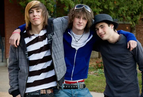


